The Nordic countries have a long tradition of minimalistic design and architecture, which is reflected in their use of color as well. Nordic color schemes are characterized by a focus on neutral, muted colors with an emphasis on texture and contrast.
The Origins of Nordic Colors
Scandinavian design emerged in the 1950s and 1960s as a reaction to the ornate and highly decorative styles of the past. Influenced by the modernist movement and inspired by the natural landscape of the Nordic region, minimalist designers such as Alvar Aalto and Arne Jacobsen introduced new forms and materials to furniture design, architecture, and interior decoration. Their work reflected a belief in the beauty of simplicity, functionality, and honesty in materials, which in turn influenced the use of color in Nordic design.
The Palette of Nordic Colors
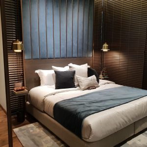
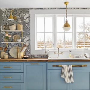
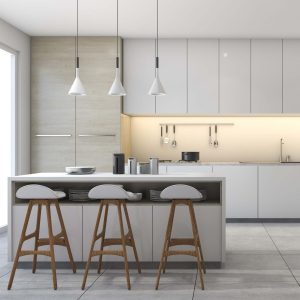
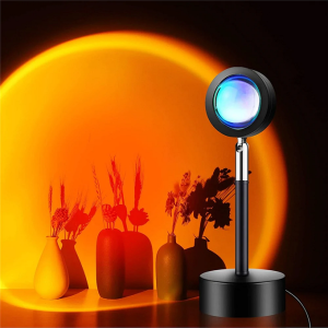
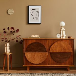
Nordic color schemes are characterized by muted, understated hues that evoke the natural elements of the region. The color palette of Nordic design is heavily inspired by the landscape, including the sea, the sky, the snow, and the forests. Neutral colors such as black, white, gray, beige, and brown play a dominant role, and are complemented by blues, greens, and soft pinks.
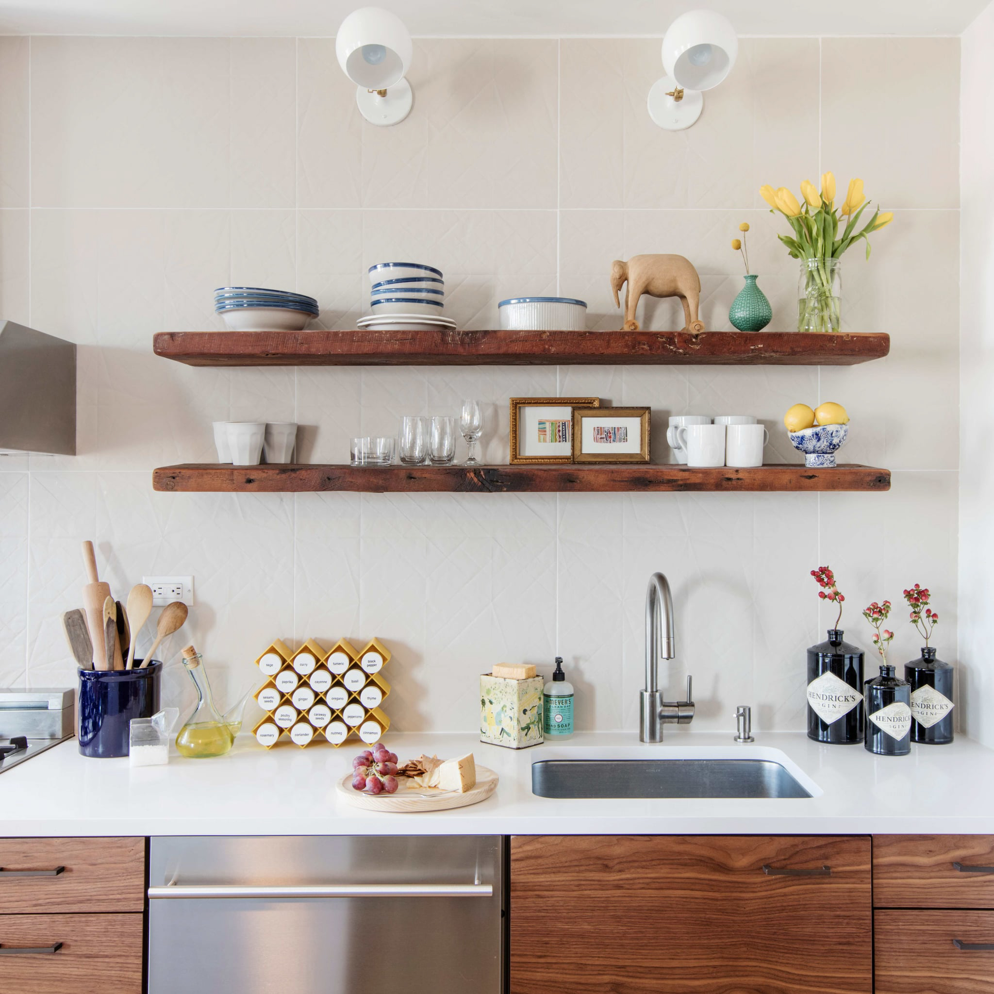
One interesting thing about Nordic colors is the way they are used in different contexts. In interior design, for example, there is a preference for light-colored walls, which create a sense of space and lightness. To add visual interest, designers often include contrasting elements such as dark floors, furniture, or accents. In fashion, Nordic colors are often used to create sleek, minimalist looks, while in graphic design they are used to create clean and elegant layouts.
The Texture and Contrast of Nordic Colors
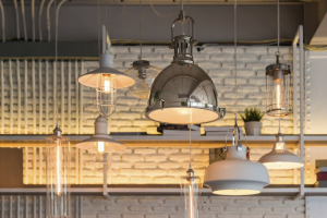
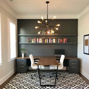
In Nordic design, the use of texture and contrast is just as important as the use of color. Natural materials such as wood, wool, and leather create a sense of warmth and coziness, while shiny surfaces such as metal or glass add a touch of modernity. The combination of rough and smooth surfaces, matte and glossy finishes, and light and dark tones creates a harmonious and balanced space.
Another important aspect of Nordic design is the use of contrast. By incorporating complementary colors or materials, designers create visual interest and depth. For example, a brown leather sofa against a light gray wall creates a striking contrast that draws the eye, while a black ceiling in a white room adds drama and sophistication.